NMHC Brand Guidelines and Logo Use
This page provides instruction for the use of the NMHC logo to maintain the standard and consistency of the NMHC brand across all mediums.
Contact Conor Ellis, Senior Marketing Associate with any questions.
Staff Resource
Master Logo - Preferred
This is the most commonly used version of our logo. We encourage the use of this logo, before any other version, if this is to be used on a white background.
Do not use this version of the logo on a background other than white.

Master Logo - Flat
The flat version of the logo may be used in circumstances such as 1 color print jobs or in cases where the gradient version will not read well. Do not use this version of the logo on a background other than white.

Isolated Master Logo
The NMHC acronym mark can be used alone in cases where the Council’s full name is mentioned in close proximity to the mark or when space is limited. Do not use this version of the logo on a background other than white.

White Logo (Highly recommended)
This logo is the best version to include in your materials as it provides a more coherent way to use the NMHC brand in conjunction with your own.

Logo Misuse: Dos and Don'ts

1. Outlining or add a stroke

2. Altering the weight of the type

3. Altering the placement of any of the elements

4. Stretching or skewing the proportions

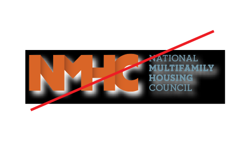
5. Applying effects such as drop shadows or embossing

6. Altering color

7. Rotate any elements

8. Use a full color logo on a background other than white

9. Use a knocked-out version of the logo on a similar color
Membership Logo

Secondary and Event-Specific Logos
Secondary versions of the logo are available upon request. These logos include that of the NMHC PAC, Emerging Leaders Program, NMHC Research Foundation, NMHC Annual Meeting etc. Please email NMHC’s Conor Ellis with logo requests.


